This week’s piece by Eli Schiff (ever the Apple critic) is no different from his previous ones.
The topics cover an iPad-specific version of iOS, lack of `groups` of apps on Apple Watch’s home screen, and my personal favorite, Control Center inconsistency:
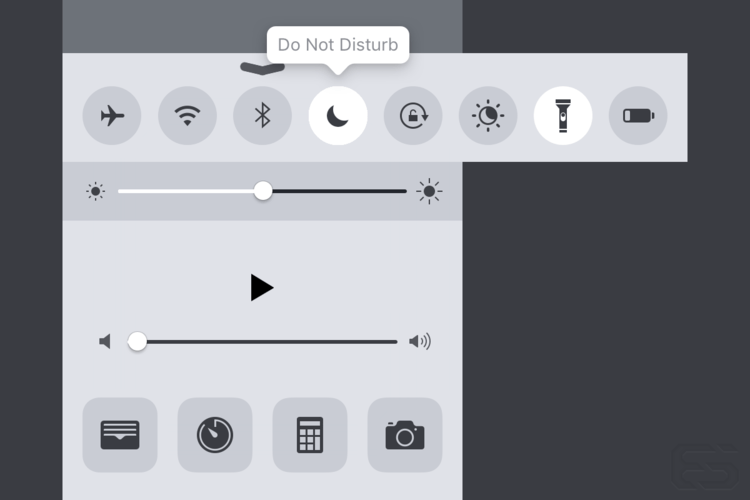
As it stands today, the top row of circular buttons indicates a consistent pattern of displaying mode toggles for the operating system, whether it be for Airplane Mode, Wi-Fi, Do Not Disturb etc. The bottom row has the traditional app icon mask, indicating that it is appropriate to display app shortcuts in that area. This pattern is largely followed except for the placement of the flashlight toggle.

Note that the flashlight has been placed in the toggle area and the app shortcut for the Wallet app has replaced it. Additionally, if no labels are to going to be on by default, then tooltips should display on press. Spillover toggles and apps that wouldn’t fit in the screen area could be scrolled into view.
Why is the flashlight on that bottom row?
