From the Instagram blog (with my commentary throughout):
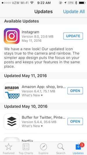
Today we’re introducing a new look.
Oh, sweet! Except it’s ugly?
You’ll see an updated icon and app design for Instagram.
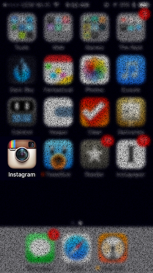
Inspired by the previous app icon, the new one represents a simpler camera and the rainbow lives on in gradient form.
I’m not sure how “inspired by the previous app icon” this new one can be, when the previous one had no annoying gradient and looked like a camera, but what do I know?
The iOS 7+ ethos has come full circle. The other day, while I ranting about modern app design, Allison said to me, “I remember when you just couldn’t wait for everything to be flat.”
That’s totally true.
In 2012, when everyone was lamenting rich corinthian leather, I wanted something different. But this current “different”—not so much. This isn’t what we wanted. Not at all.
The grass is always greener, I guess.

But, in the meantime, I turned off Automatic Downloads of app updates. This way, I can be that crazy person who retains the old app UI as long as possible:

