I’m a big fan of Cotton Bureau. I’ve been buying their t-shirts for the past couple of years. I was there almost from the beginning (which, for me, was the first Tapbots t-shirt!)
The company continues to be a great spot for unknown (and known) designers to showcase and sell their skills.
And yet, this past week, they did something I thought was just plain crazy: they redesigned their landing page.
It was a soft launch if there ever was one: I started that morning like I do every morning, by locating the Cotton Bureau pinned tab in Safari [Technology Preview] and clicking on it.
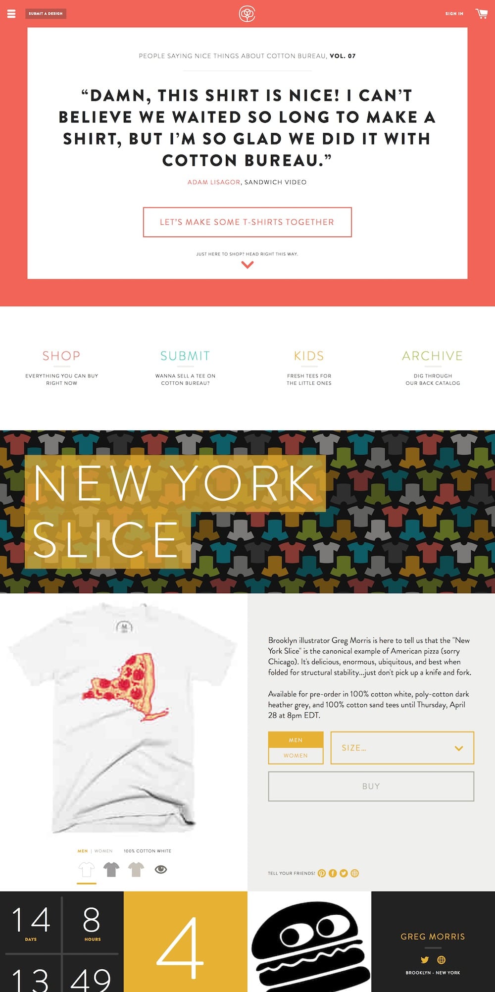
However, instead of seeing a grid of t-shirts as was the case for the past two years, I saw something else:

What is …this!?
I immediately tweeted to Cotton Bureau, wondering if I was on crack, or if their homepage really looked like …this:
@ToniWonKanobi Thanks Anthony…yep, it’s right there at /shop if you wanna see everything.
— Cotton Bureau (@cottonbureau) April 8, 2016
“At least the ‘old’ homepage is still there,” I thought.
Would could have prompted them to do such a thing?
Dropping the Ball 
Here’s Nathan Peretic, from the previously-linked article on Medium:
Since launching, however, many have gently and not-so-gently pointed out some of our more glaring omissions. The huge focus on soliciting designs can be off-putting to customers. Viewing at it on a 5K iMac is, uhm, intimidating at best. We even forgot to show prices and size charts on the featured products.
What disappointed us most […] was that what was so obvious in our heads was being misinterpreted by what felt like… pretty much everyone. Even for people as headstrong as Jay and I, it hurts to feel you’ve dropped the ball.
Indeed.
I don’t want to kick a front end developer when they’re down, but man: I really think they dropped the ball.
Cotton Bureau “Users” ≠ “Visitors” 
Before I get too specific with my complaints, let me outline my use case for Cotton Bureau, which helps to explain why I have such a hard time with their new design.Here’s my routine:
- On a daily basis (typically), I go to their website, scan everything from top to bottom (in case I’ve missed something from the previous days)
- If I like a shirt, I’ll check to see if it’s available in the materials I prefer (I like “100% Cotton”, or “Poly-cotton,” because I think those shirts fit me better)
- If said shirt is available in the fabric I like, I’ll set a reminder to myself so I can buy it before it goes away
- When that reminder lands in my inbox, I buy that shirt
- Done.
My `Cotton Bureau consumption` workflow is quite different from the average Cotton Bureau “visitor,” as Peretic notes:
To understand where we’re coming from and why we’re trying to provide that experience, you need to know how Cotton Bureau works on a fundamental level. The vast majority of sales come from individuals bypassing the home page and visiting a specific shirt page [emphasis added]
That’s Twitter, Facebook, and other social media.
[It’s almost entirely through word-of-mouth. Let’s call this group of people “visitors”. Visitors are more than happy to use Cotton Bureau to buy the thing they came to buy. Sometimes they take advantage of a feature like the reminder emails to buy the thing they came to buy at a later time, but rarely do they venture beyond the product they originally came to purchase [emphasis added].
So, the average “visitor” gets to Cotton Bureau by way of social media. If they want the shirt, they buy it. If not, they close the tab/window, or swipe back in whatever app they’re in. In other words, they leave.
[When they purchase an item] you might say they become “users” of Cotton Bureau. A user may click a related product, create an account, sign up for the newsletter, browse all the available shirts, interact with us on Twitter, or even submit a design. When we design and build the site, we do the best we can to encourage visitors to become users—and we constantly ask ourselves how we can create more users, whether by converting visitors into users or by attracting more visitors to Cotton Bureau in the first place [emphasis added].I’m a “user.” Cotton Bureau wants more “visitors” to become “users.” Makes sense.But what does that have to do with redesigning the home page?What does that have to do with making the homepage a stream, rather than a reverse-chronological grid?
Stream > Grid 
More from Peretic:
We want to elevate the best designs to give them the greatest possible chance of succeeding. Whether you’re a new visitor or an old hand, we’re hoping to bring everyone together on the home page to rally around—and potentially even disagree about—smart, sophisticated, funny, thoughtful, beautiful shirts. We want Cotton Bureau to be a destination for t-shirt enthusiasts and design junkies. We want to create demand for shirts where demand otherwise didn’t exist [emphasis added].
And, from earlier in the article:
As part of the mission I described previously, we are very interested in 1) staying in business and 2) enabling great design.
So there it is:
They want to promote designs that don’t get enough attention on their own.
That’s their goal.
They think the stream provides access and attention to designs that simply weren’t selling (but should have been, according to the Cotton Bureau team).
So, it’s like curation, sort of.
And there’s nothing wrong with that.
Grid > Stream 
There are problems with this new design:
- It’s harder to get a quick overview of all the shirts available.
- While this may be an insignificant change for the average “visitor” to the site, it completely alienates “users” like me
- It’s really hard to get back to the “grid” page
- The design is technically responsive, yet practically unusable
- The “above the fold” content is only relevant to designers, which stands in opposition to their first “mission statement” goal, which was to “stay in business”
- The testimonials are great way to entice more designers to submit their work, but that doesn’t appeal to “visitors” and “users,” whose contributions actually keep the site afloat!
Stream + Grid 
I have a few suggestions. And despite my degree in armchair front end design, I will try not to pick apart too much of their obvious hard work:
-
If they are going to keep the “stream” as the homepage, put a link at the very top that says “See All Shirts,” or something to that effect.
The content of said hyperlink?
https://cottonbureau.com/shop, which is the “grid” `homepage` link.This allows the casual “visitor” and longtime “user” to quickly see everything the site has to offer.
-
Responsive design is cool, but put in an
@mediaquery (or do the meh thing and use JavaScript) to add amax-widthto the main content container (andmargin: auto;the same container), so that the content isn’t crazy on big screens like the aforementioned Retina 5K iMac.For “mobile,” let the parent container for the content go
width: 100vw;andheight: 100vh;. Heck, even usedisplay: flex;to take care of that stuff for you. Please do all that nifty “responsive” looking stuff on mobile. But make desktop browsing less crazy. -
I think the whole testimonials thing is cool. But put that in another page–say,
/designers/testimonials?—or something. And then, like with the/shophyperlink suggestion above, unhide that from the hamburger menu so that designers know where to find the/designers(or whatever) page.
Here’s my take:
You can enable designers without disabling the average “visitor” and “user.”
If it isn’t already apparent, I’m not the only person to dislike their new homepage. The Cotton Bureau Twitter account has, in the past three days, passively asked for feedback on their new design. (Who asks for feedback when all the previous feedback has been positive?)
Setting aside all my criticism of the new design: I won’t be going anywhere—and I suspect other “users” feel the same way. Viewing Cotton Bureau is still a daily routine for me. The difference is that the address of the Cotton Bureau pinned tab is now https://cottonbureau.com/shop, instead of the homepage. Not a big deal.
I hope they find what they’re looking for in this new design. I hope it drives more activity on the site. I hope it helps unknown designers get known.
Most of all, I hope it helps keep Cotton Bureau going. After all, where else can I get a new Star Wars shirt every month?
