Apologies for the lack of posts these past few weeks. We are currently living out of a suitcase, waiting to move into our new house. There are lots of articles in my Instapaper “TheOverAnalyzed” folder—ones I’m sure to share here over the next few weeks. As always, thanks for reading
watchOS 3 
“Feels like a whole new watch,” says the Apple headline. And that’s a pretty accurate take on what’s changed in watchOS 3.
Faster Apps 
Yes, there are still apps. And yes, nobody really uses apps on watchOS. But now that apps and glances are part of the same processes, apps now launch faster. “Seven times” faster, according to Kevin Lynch. Not bad.
Revised User Interface 
Highlights:
-
The Contacts button has been re-mapped to at least one other more useful function
-
Like on iOS 7+, swiping up from the bottom of the display invokes Control Center
-
Faces can now be changed via swiping left/right
Overall, watchOS 3 is closer to what we all hoped for and expected with Apple Watch. Utilizing the same 1±year-old hardware, Apple seems to have managed to turn one of their most sluggish and frustrating devices into a less frustrating one. Let’s hope the demonstrations are representative of actual end-user reality.
tvOS 
Nothing big here besides Dark mode (Finally™). Also, Single Sign-on, so folks can avoid that terrible screen that asks for an authorization code from a cable provider. Siri is better. That’s about it.
macOS Sierra 
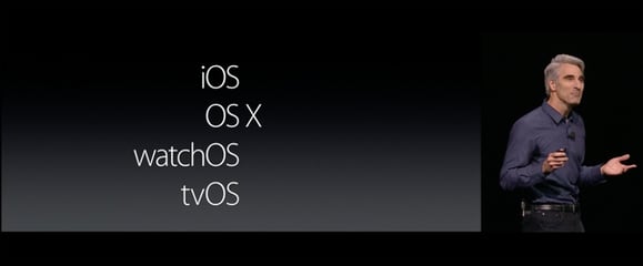
RIP “X” 
Yes, the rumors are true: Mac OS X no longer exists—macOS has arrived.
I’m not as opposed to the lower-case “M” as others, and it certainly fits better alongside Apple’s other platforms.
Optimized Storage 
Like iCloud Photo Library, but for your whole Mac. This will be useful. I’m just glad Apple has upped the included iCloud storage for all iCloud accounts’s. Oh wait—nevermind.
APFS 
This wasn’t even mentioned in the keynote, but it’s a pretty big deal: Apple has a new filesystem! HFS+'s days are numbered, because Apple Filesystem (APFS) is coming soon.
From the link above:
Apple File System provides several new features, including optimization for Flash/SSD storage [emphasis added], copy-on-write metadata, space sharing, cloning of files and directories, snapshots, fast directory sizing, and atomic safe-save primitives.In case you were wondering, HFS+ was designed in the era of floppy disks.
Siri 
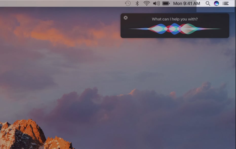
I’m not sure why they used a colored icon in the Menubar:
iOS 10 
Let’s get some features out of the way:
- Messages
- Rich links (like Slack)
- Handwriting recognition (Like Newton)
- Text effects (like Snapchat)
- Emoji improvements (like every other mobile platform)
- Apps (why not?)
- Maps
- They’re so much nicer looking now
- Lock Screen
- Raise to wake (so 6s users can finally see their Lock Screen notifications again)
- Widgets (like Android)
- Raise to wake (like Android)
- Rich notifications (like Android)
- Deleting default apps (not mentioned, but oh, so nice!)
- Swift Playgrounds
- No Xcode required!
… and more.
For the most part, iOS 10 is stereotypical Apple. “Iteration, Not Revolution,” I’ve called it. The improvements made to Apple’s most important platform aren’t game-changing. Pessimistically, they are merely catch-up measures. “Android has had these features for years,” I can hear the anti-Apple’ers saying.
Optimistically, it’s Apple doubling-down on what makes them great. If it seemed like they spent over half of their iOS 10 portion of the keynote talking about Messages changes, that’s because they did. Messages is Apple’s most used app, according to Craig Federighi. Why not bolster Messages’s position on user’s Home Screens? Why should Apple let WhatsApp and Snapchat have all the fun? This is Apple at it’s best.
iOS 10’s Design Inconsistencies 
Most of what I wanted to discuss regarding iOS 10 concerns Apple’s UI and design choices. Generally speaking, some of said discussion might apply to their other platforms (since watchOS and tvOS are direct descendants of iOS). Still, iOS is Apple’s baby. It’s the operating system powering Apple’s cash cow, the iPhone. It’s their most important platform, so I’ll focus on iOS.
iOS is where Apple makes paradigm shifts. It’s where Apple makes big changes. It’s where Apple tests the waters, and where Apple tells the world what UI should be.
And for the 10th version of iOS, Apple has shown everyone that their UI is a lot of pizazz, with seemingly little thought and polish.[1]
Bold is Back, But It’s Awkward 
“Big. Bold. Beautiful,” the heading says. Apple’s marketing copy wasn’t haphazardly chosen: it epitomizes a UI shift in Apple. No, the UI shift isn’t even close to what Eli Schiff would want, but it’s an interesting change, nonetheless.
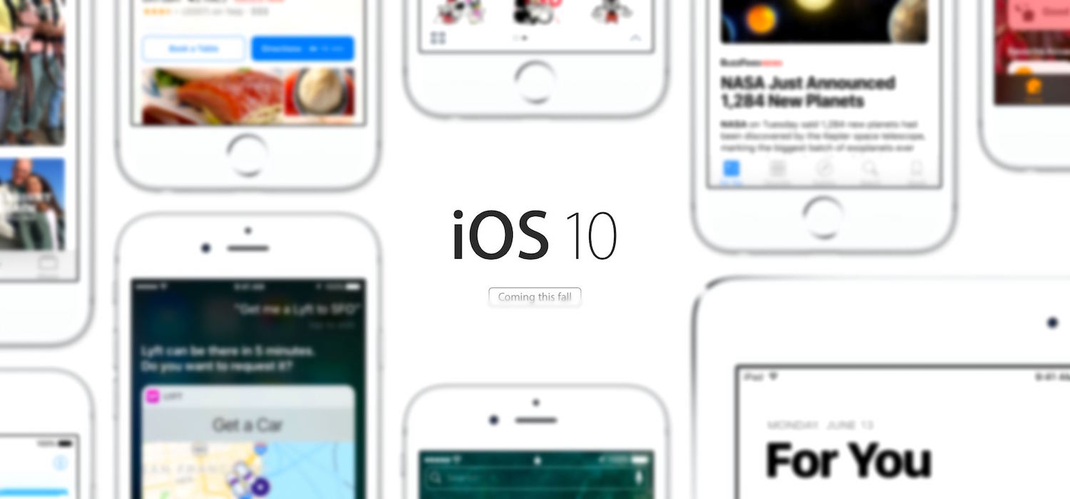
There was a time when Helvetica Neue Ultra Light was all the rage. If Apple’s use of what appears to be an Ultra Bold version of San Francisco is any indication, ultra light is out, and bold is in.
Say what you will about the contrast between their Ultra Bold headings[2] and body text—it certainly looks better than feather-weight sans serifs set against a white background. Still, I can’t help but wonder why only two apps feature the new design (Apple Music and Apple News). Are Eddy Cue’s design lieutenants operating in a vacuum, separate from the rest of the iOS designers? Bold may be back, but right now it’s used so infrequently across iOS 10 that it’s just awkward.
Buttons are Back, But Their Corners Are Confused 
At WWDC '13, Apple launched iOS 7. That very first beta was drastically different from anything we had seen before on iOS. Gone were text shadows, gradients, and other visual affordances. Text was the new button; there were no buttons.
Over the course of that summer—and over the next three years, really—Apple seems to have slowly added-back the previously-removed visual affordances.
Let’s talk about buttons.
I like the new buttons. I like “rounded rect’s” as much as the next wannabe designer. I like the added “Depth.”
I’m not alone:
I like these buttons that look like buttons in iOS 10.
— John Gruber (@gruber) June 13, 2016
What I don’t like is that the border radii of the buttons are different from the border radii on the Lock Screen notifications (widgets), etc. The border radii are not consistent across the OS:
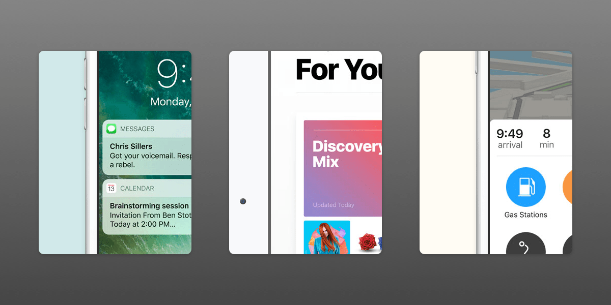
I can’t imagine defining a border radius in Objective-C or Swift as any more difficult than how web designers use the border-radius property in CSS. And if iOS developers are using variables, why not make it easy on themselves and with one declaration, set a border radius that’s used everywhere?
There might exist a situation where different border radii are appropriate, but for the life of me, I can’t think of any.
Padding Isn’t Back at All 
Refer to this mockup illustrating the padding (“gutter”) inconsistencies in the new Maps app:
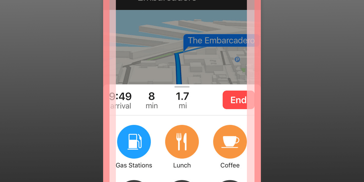
Look at the padding left of the “9:49” arrival time. Next, look at the padding left of the “Gas Stations” icon. Why are they unequal?
Moreover, why is there less vertical padding around the top bar elements compared to the vertical padding around all the location icons in the bottom section?
Finally, why is there almost no padding around Lock Screen notifications?
I could go on, but I’ll spare you.
A friend recently asked if it’s ever exhausting—following lots of opinionated design critics and being privy to their whining (let’s call it what it is). My immediate answer was “No, because I agree with them 100%.” I still stand by my answer, but I’ll expand on it: if there’s anyone to blame for such vocal and voracious design criticism aimed at Apple, it’s Apple itself!
They made the original Macintosh. They were the ones with incredible attention to detail (so much so that they made the inside of the Macintosh look as good as the outside).
They gave us revolutionary product after revolutionary product.
All the while, design was foremost on their minds.
While their hardware continues to impress, Apple’s software design ethos has become muddied and incongruent.
Some say that this new breed of “design criticism” is unhelpful. Instead of constructive, it’s just overly negative, they say. But I am certain that if weren’t for such design critics, iOS 10 would not look as good as it does.
That’s right: iOS 10 does look better than iOS 7-9. Despite my criticism, iOS 10 is absolutely a continuation of the positive trend towards a better UI. If we can compare new versions of iOS to app development, iOS 7 was an alpha. iOS 8 and 9 were both betas. iOS 10 is the public beta. I have no doubt that iOS 11 (or even a point release of 10) will be the version of iOS we’ve been waiting for.
I take that back: since iOS 7, Apple’s clearly exhibited UI polish with their animations.
Generally speaking, their UI animations don’t really make sense when observed across the whole of iOS. And sometimes it’s hard to understand why they chose one animation over another. Other times, it’s not clear why they chose different animations for similar user interactions.
But what is clear is that Apple developers really know how to leverage
CoreAnimationto make some pretty awesome animations. iOS 10 is no exception to this rule. I love all the new bouncy and friendly animations accompanying many of the new Snapchat-like Messages features.I believe this is what Jony Ive’s design direction is all about. I just wish they would apply the same level of thoughtfulness that they do to animations, to the design language of the OS as a whole. ↩
